Bi-Weekly Combo: Subheads
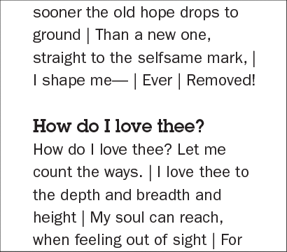
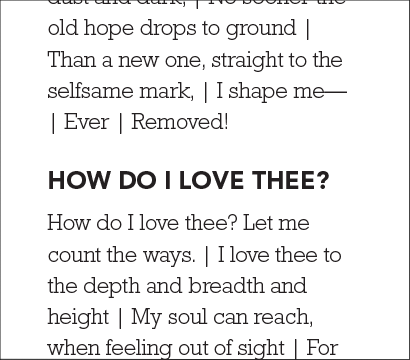
A common time to investigate matching two typefaces together is when choosing a subhead to compliment body text. The idea is to find a typeface that stands out from the body text, creating hierarchy. This makes the subhead easier to find and the text easier to scan by the viewer. Usually, a heavier san serif or slab serif is chosen to go with a serif. Below are a few examples.

ITC Franklin Gothic Std Demi with Bembo Std Regular

ITC Lubalin Graph Demi with ITC Franklin Gothic Std Book
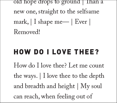
To further distinguish between the subhead and the body text, try using all caps or increasing tracking. Adding some negative before or after the subhead also helps set it apart. You know what I always say: embrace negative space.

Avenir LT Std 95 Black with Rockwell Std Light

DIN-BlackAlternate with Adobe Caslon Pro Regular
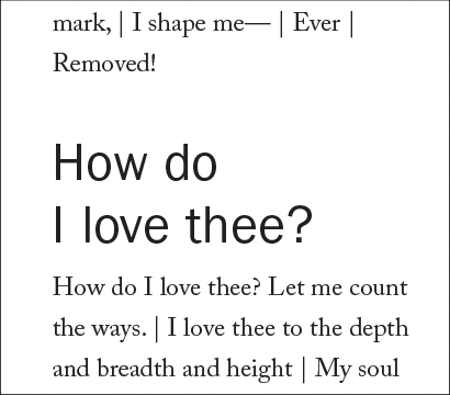
You can also try some less traditional things. Below I’ve used a lighter weight of the type, but at a larger point size.

ITC Franklin Gothic Book with Bembo Std Regular
There are many other ways to add emphasis to subheads from hanging the subhead outside of the margin to using color. But it all starts with choosing two typefaces that work well with each other.
Thanks to Elizabeth Barrett Browning and Robert Browning for their poetry.
One Response
Leave a Reply to Muhammad Rizqy
- Recent posts:
- Great Article from Typography.com
- New Trend: typefaces create their own matchmaking
- The New Archer Meets Its Match. Several of Them, Actually.
- Matching Typefaces to Logo Designs
- Becoming a Matchmaker: How to Combine Typefaces Effectively, part 3 of 3
- Becoming a Matchmaker: How to Combine Typefaces Effectively, part 2 of 3
- Becoming a Matchmaker: How to Combine Typefaces Effectively, part 1 of 3
- Post-Valentine’s Day Post
Nice Article,…………………