Matching Typefaces to Logo Designs
Note: I’ve had a bit of a hiatus from posting, but hope to get back to something more regular.
A few months ago I finished designing a logo for an organization called Sardonyx. I designed some marks with an “S” and then experimented with some different typefaces. There are usually two ways to go when choosing type for a logo:
- Create continuity by choosing a typeface that works well with the logo
- Create contrast by choosing a typeface that shares something with the logo but is largely different from it.
Below are some of the combinations of typefaces with which I experimented along with some rationale for each:
Logo with Adobe Garamond Pro
Sardonyx is a company that needs to communicate reliability and safety, hence the S that also forms a shield. The geometric shield and S are contrasted with the formal serif typeface Adobe Garamond Pro. The increased letterspacing creates some open negative space that relates to the negative space in the logo. The type is set in all caps, which lends a formal feel and also creates a rectangular shape to help it relate back to the geometric shapes in the logo.
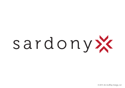
Logo with Museo
Here’s an example of trying to complement the shapes in the logo with the typeface. Another aspect of Sardonyx is that it brings together multiple parties to accomplish something. The four arrows come together to create an x, representing this collaboration. There is a readability issue (do you read sardonyx or sardony?), but look at the way the arrows form the x. The slab serifs of Museo (designed by Jos Buivenga) relate to the blocky arrows and letter x. The curves in the lowercase letterforms, however, create a contrast to the sharp points in the lettermark of the x. They also give the logo a more approachable, friendly feel.
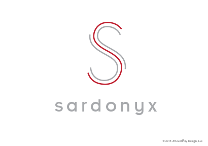
Logo with Insignia
The S is made up of 3 separate lines, again a nod towards collaboration and separate elements that come together to benefit the whole. This solution is another example of trying to find a typeface that complements the lettermark. The geometric S is complemented by Neville Brody’s typeface, designed in the 1980s, Insignia whose letterforms are based on a circle. The lowercase letterforms show the curves in the letters s, a, r, d, o, n, and y, as opposed to their angular capital letter counterparts.
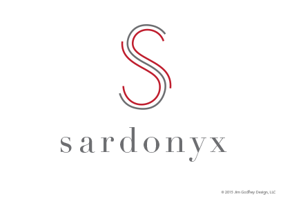
Logo with Didot
Here’s the same logo with Didot (originally designed by Firmin Didot in 1783). It provides a nice contrast to the geometry of the s, while still maintaining some harmony due to the precise geometric underpinnings of the type.
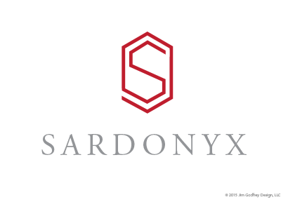
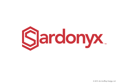
So, which logo did the client go with? None of the above. They liked the S as a shield, but wanted something where the type did not contrast with the logo, but matched it. I created 3 variations in weight to show them, all with the word Sardonyx set in the typeface Avenir (designed by type legend Adrian Frutiger). The weight is harmonious with the s shield and there are some nice curvilinear aspects to the type that contrast the points in the shield. As you can see, the client also wanted a brighter red.
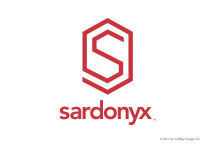
Final vertical logo with Avenir. A horizontal version is below.
Leave a Reply
- Recent posts:
- Great Article from Typography.com
- New Trend: typefaces create their own matchmaking
- The New Archer Meets Its Match. Several of Them, Actually.
- Matching Typefaces to Logo Designs
- Becoming a Matchmaker: How to Combine Typefaces Effectively, part 3 of 3
- Becoming a Matchmaker: How to Combine Typefaces Effectively, part 2 of 3
- Becoming a Matchmaker: How to Combine Typefaces Effectively, part 1 of 3
- Post-Valentine’s Day Post