New Trend: typefaces create their own matchmaking
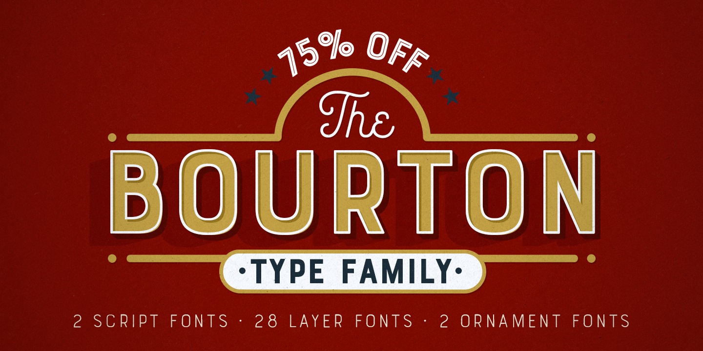
One new trend that’s become a part of the typographic landscape recently is the inclusion of contrasting typefaces within a type family. The type designer creates a main font family and then adds another font to compliment. This makes it easy to find a “match” to use with the main typeface, with beautifully predictable results. One such family is Bourton, designed by Kimmy Kirkwood. Bourton is a san serif typeface with elements drawn from vintage san serifs of the 1930s and 40s blended with a more modern aesthetic. It is also a layered typeface, meaning you can add or remove the outlines, inlines, and drop shadows from the type. As far as matchmaking goes, it comes with a script typeface in two weights (light and bold) that serve as a nice compliment to the san serif.
Some might say that this has already been going on for decades in the form of super families, meaning typefaces with both a serif and san serif style (Matthew Carter’s typeface Walker comes to mind, along with Stone and Meta). While this is true, one distinction would be that type families like Bourton have a much stronger contrast in the aesthetics of the typefaces and the weights and styles are much more limited than a super family.
A typeface that kind of straddles both trends is Taberna from Latinotype. The designers, Jorge Cisterna and Rodrigo Fuenzalida, drew inspiration from the signage found at bars and on packaging for liquors. The typeface features a serif and san serif and is a layered typeface. Both the serif and san serif have some similarities, but the range of styles is based on the layering of elements, as opposed to the dozens of weights and styles that super families have.
Leave a Reply
- Recent posts:
- Great Article from Typography.com
- New Trend: typefaces create their own matchmaking
- The New Archer Meets Its Match. Several of Them, Actually.
- Matching Typefaces to Logo Designs
- Becoming a Matchmaker: How to Combine Typefaces Effectively, part 3 of 3
- Becoming a Matchmaker: How to Combine Typefaces Effectively, part 2 of 3
- Becoming a Matchmaker: How to Combine Typefaces Effectively, part 1 of 3
- Post-Valentine’s Day Post