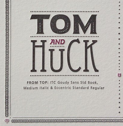
Poster Details: Tom and Huck
Goudy Sans + Eccentric
[ ITC Goudy Sans Std Book, Medium Italic + Eccentric Standard Regular ]
One of the greatest tandems in literature is Mark Twain’s Tom Sawyer and Huckleberry Finn, who debuted in The Adventures of Tom Sawyer (1876). Tom is envious of Huck’s freedom to do as he pleases, without having to answer to any adult (Huck’s dad is the town drunkard). The typefaces used to depict these two characters are as unique as they are.
HUCK is set in Eccentric, a typeface designed by Gustav Schroeder for the Central Type Foundry in 1890. Schroeder first came to America in 1881 and apprenticed at the foundry. Eccentric certainly lives up to its name, not unlike many unique typefaces from the 19th century spawned by the need of advertisers to attract the public’s attention on broad sheets and posters. Its letterforms are extremely vertical, accentuated by the cross bars in the letterforms that sit at more than three quarters of the height of the letterforms. The strokes are finished with slab serifs using subtle brackets. Many of Schroeder’s other type designs, from Art Gothic to University Gothic, are novelty typefaces.
Goudy Sans provides a nice contrast, with its heavy letterforms, for the word TOM. Like many of Frederic Goudy’s faces, it also has some eccentricities, although compared to Schroeder’s, they are much more tame. You’ll notice the diagonal angle on both ends of the crossbar on the T and the unique shape of the letter O. The petite pointed serifs at the end of the strokes contrast nicely with the slab serifs of Eccentric. Goudy Sans was designed for Monotype from 1922 to 1929.
Where to buy the typefaces:
Adobe.com, Linotype.com, fonts.com
Other typefaces from Gustav Schroeder:
DeVinne, Art Gothic, Romana, Cloister. Complete list.
Other typefaces from Frederic Goudy:
Kennerly, Deepdene, Bertham, Hadriano, Goudy Ornate, Copperplate. Complete list.
Sources:
http://www.myfonts.com/person/Gustav_F._Schroeder/
http://store1.adobe.com/cfusion/store/html/index.cfm?store=OLS-US&event=displayFontPackage&code=1450
http://www.linotype.com/2143/gustavfschroeder.html
The Inland and American printer and lithographer, Volume 22
(Accessed on googleBooks: http://books.google.com/books?id=g_ooAAAAYAAJ&pg=PA338&lpg=PA338&dq=gustav+F.+Schroeder&source=bl&ots=AFh9rccXzs&sig=tWwv46l-NWAnGJGVobnyJ2UrGHM&hl=en&sa=X&ei=-7rWT-nRLsjC2wWgwcWOCw&ved=0CFQQ6AEwAg#v=onepage&q=gustav%20F.%20Schroeder&f=false)
Recasting A Craft: St. Louis Typefounders Respond To Industrialization By Robert A. Mullen
Leave a Reply
- Recent posts:
- Great Article from Typography.com
- New Trend: typefaces create their own matchmaking
- The New Archer Meets Its Match. Several of Them, Actually.
- Matching Typefaces to Logo Designs
- Becoming a Matchmaker: How to Combine Typefaces Effectively, part 3 of 3
- Becoming a Matchmaker: How to Combine Typefaces Effectively, part 2 of 3
- Becoming a Matchmaker: How to Combine Typefaces Effectively, part 1 of 3
- Post-Valentine’s Day Post
