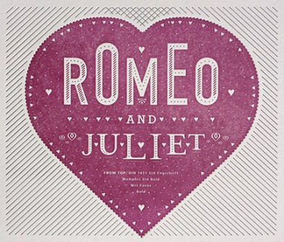
Poster Details: Romeo And Juliet
From Top:
DIN + Memphis + Mrs Eaves
[ DIN 1451 Engschrift + Memphis Std Bold + Mrs. Eaves Bold ]
Those old arch enemies. Yes, the Montagues and the Capulets, but also in a typographic sense the Germans and the Brits. DIN is an abbreviation for Deutsche Industrie-Norm, a typeface used for road signs in Germany and designed in 1936. Mrs Eaves was inspired by John Baskerville’s English typeface from the 1700s. The tension between the two countries may not be palpable today like it was back in the 1930s, when Memphis was designed by Rudolf Wolf for German foundry D. Stempel AG, but there is a nice contrast between the two typefaces. DIN has a precise mechanical geometry, while there is a refined and elegant beauty evident in Mrs Eaves. Mrs Eaves, by the way, was designed by Zuzana Licko (co-founder of emgire and a native of Czechoslovakia) in 1996.
![]()
One other thing to note is the criblé inside the heart, which is the white dots that break up the otherwise solid red color. This was first used in the 16th century by Geoffroy Tory in some of the initial capital letters he designed for use in books.
![]()
Where to find the typefaces today:
DIN and Memphis = Adobe or Linotype
Mrs Eaves = emigre
![]()
Other similar combinations:
Condensed San Serifs: Trade Gothic, Univers Condensed Bold, Helvetica Neue Condensed Bold, Champion Gothic
Serifs, beautiful but reserved:Baskerville, Caslon 540, Adobe Garamond, Chronicle
Leave a Reply
- Recent posts:
- Great Article from Typography.com
- New Trend: typefaces create their own matchmaking
- The New Archer Meets Its Match. Several of Them, Actually.
- Matching Typefaces to Logo Designs
- Becoming a Matchmaker: How to Combine Typefaces Effectively, part 3 of 3
- Becoming a Matchmaker: How to Combine Typefaces Effectively, part 2 of 3
- Becoming a Matchmaker: How to Combine Typefaces Effectively, part 1 of 3
- Post-Valentine’s Day Post
