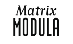
Weekly Combo: Matrix + Modula
Matrix II Italic Bold + Modula Bold
Last week, I coupled Matrix with Brothers. This week, Matrix starts seeing someone else: Modula. Modula was the first headline face that Zuzana Licko designed for Emigre at a high resolution. This type family has a san slab serif version to go with the sans serif. It is a condensed typeface and I’ve combined the bold weight here with the bold weight of Matrix. The rounded letterforms of the italic Matrix provide a nice contrast to the rigid, vertical strokes of Modula and the similar weights build some unity between the two. Of course, it also helps that Licko designed both typefaces. So take Matrix and Modula out on a speed date and see if they compliment each other, or if it’s good-bye after a promising 2 minutes of getting to know one other.
By the way, if you haven’t heard of Zuzana Licko, you need to read up on her. She is one of the pioneers of digital typography and has created some unique and wonderful types. My personal favorite is Mrs Eaves. It’s beautiful. Here are links to a couple of articles about her:
Emigre 15 – an interview with Rudy VanderLans
FAQs – a compilation from the year 2000
Where to buy the typefaces:
emigre.com
Leave a Reply
- Recent posts:
- Great Article from Typography.com
- New Trend: typefaces create their own matchmaking
- The New Archer Meets Its Match. Several of Them, Actually.
- Matching Typefaces to Logo Designs
- Becoming a Matchmaker: How to Combine Typefaces Effectively, part 3 of 3
- Becoming a Matchmaker: How to Combine Typefaces Effectively, part 2 of 3
- Becoming a Matchmaker: How to Combine Typefaces Effectively, part 1 of 3
- Post-Valentine’s Day Post
