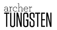
Weekly Combo: Tungsten + Archer & Tungsten + Acropolis
I know I post a lot of older typefaces and their combinations. This week I’ve looked at some newer weights of Tungsten from Hoeffler & Frere-Jones that were just released. There are a couple of interesting combinations from two other typefaces in their library: Archer and Acropolis. The clean and condensed letterforms create a perfect foil for many typefaces, but Acropolis’s bold weight and heavy slab serifs form a nice contrast to the extra light weight of Tungsten. Archer’s curvilinear letterforms contrast well with the rectilinear forms of Tungsten.
Where to buy the typefaces:
Leave a Reply
- Recent posts:
- Great Article from Typography.com
- New Trend: typefaces create their own matchmaking
- The New Archer Meets Its Match. Several of Them, Actually.
- Matching Typefaces to Logo Designs
- Becoming a Matchmaker: How to Combine Typefaces Effectively, part 3 of 3
- Becoming a Matchmaker: How to Combine Typefaces Effectively, part 2 of 3
- Becoming a Matchmaker: How to Combine Typefaces Effectively, part 1 of 3
- Post-Valentine’s Day Post

