WHY COMBINE TYPE?
--->
Why Combine Typefaces?
A kind of short Historical review: Combining different typefaces together is a relatively recent activity. Previous to the 19th century, one typeface at a time was used for most design work (like books or broadsides) although trying to find an italic typeface to match a roman face was common. The advent of industrialism in the 19th century created a need for advertising. To attract attention to the adverts, a plethora of different type designs were created. These were mixed and matched to create contrast and visual interest.
The 20th Century marked the beginning of type families, with various weights and styles created for one typeface. The first was Akzidenz Grotesque (1896), another was Futura (1927) and in 1956 Adrian Frutiger created arguably the grandaddy of modern type families: Univers. This gave designers the ability to add emphasis and create hierarchy using one type family, bringing unity to the design. This was part of the New Typography espoused by Jan Tschichold and others; it was also part of the philosophy of the International Typographic Style.
In the 1960s and 1970s many designers were inspired by work from previous eras as they combined typefaces. In the late 1970s to the present, work from Louise Fili and Charles S. Anderson often looked to 1920s–1940s for typographic inspiration.
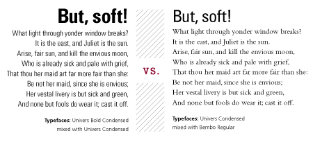
The 21st century has marked the beginning of Super Families: typefaces that included both serif and san serif letterforms designed to be used together. Mrs and Mr Eaves is an example (although they were designed more than 10 years apart). There are many times, however, where the use of multiple typefaces is desirable. A designer may want to enhance visual hierarchy. S/he may want to create visual interest, embue the design with a specific feeling or emotion, aid the viewer in reading/understanding the text, or to evoke an aesthetic from a specific time period. (See a few examples below).
Combining type requires a lot of patience, experimentation and practice. When I first began working with type, it helped to look at what others had done and to start using those combinations. Then, when I began feeling more confident, I started to venture out on my own (with varying degrees of success). If you’re looking for a good place to begin, check out the links section of this site. I also think studying design annuals like Communication Arts, Print, How, Type Director’s Annual, Publication Design Annual, etc. makes a huge difference and helps attune ones senses to some of the nuances of typefaces.
Below: Cover for a brochure I designed. The different typefaces add interest and help the viewer understand that the title is “The Informed Investor” and the subtitle is “Making Smart Investing Decisions in Today’s Volatile Market.”
(© 2012 LJ Cooper, LLC)
Below: The logo below uses a second typeface to aid readability of the smaller text and to keep “Therapeutic Massage” from being overwhelmed by “Genesis.”
(© 2012 Jim Godfrey Design, LLC)
Below: Hopefully the typefaces used below help this faux label feel like something you could purchase from a snake oil salesman in the 19th century.
(© 2012 Jim Godfrey Design, LLC)
Leave a Reply
- Recent posts:
- Great Article from Typography.com
- New Trend: typefaces create their own matchmaking
- The New Archer Meets Its Match. Several of Them, Actually.
- Matching Typefaces to Logo Designs
- Becoming a Matchmaker: How to Combine Typefaces Effectively, part 3 of 3
- Becoming a Matchmaker: How to Combine Typefaces Effectively, part 2 of 3
- Becoming a Matchmaker: How to Combine Typefaces Effectively, part 1 of 3
- Post-Valentine’s Day Post


